

Regression to the Real World
BLOG: Heidelberg Laureate Forum

By now, my friends have learned the kind of things that I am likely to be interested in, and often send me links they think I’d like. Recently I was sent something which connects two completely unexpected areas of maths, both of which I’ve written about for this blog before, and is also wonderfully silly. To start with, I’ll need to explain a bit about mathematical modelling.
Friendly Relationships
I’ve previously written about mathematical models like the Lotka-Volterra predator-prey equations – but this is a much simpler idea. Simple mathematical modelling boils down to the fundamental question: how does this real-world variable behave when this other one changes?
We call our input variable the independent variable (either something you control and can vary, or something you think might be the driver of something else) and the output is the dependent variable (something you suspect will change if the independent variable does).
For example, a simple model might study the relationship between how much a company spends on advertising and how much of a product it sells. If our independent variable is “advertising spend” and the dependent variable is “product sales”, you could work out a relationship like:
product sales = (a × advertising spend) + b
Here, b is the amount you’d sell if you didn’t spend anything on advertising at all (if advertising spend were equal to zero), and a represents how effective the advertising is – if a is zero, no matter how much advertising you do it’ll make no difference, but a large value of a would suggest the adverts are working.
This kind of relationship is called a linear model – that is, the two things increase in proportion, and the whole thing can be modelled by a linear equation, generally written as y = ax + b. Linear here means that there’s no x2, x3 or 1/x in the equation – it’s just a plain old x, multiplied by a number, maybe with a number added to it. If you plot a function like this on a graph, it’ll be a straight line.
Along the right lines
If your real-world situation is simple enough (or, the things that would make it more complicated are small enough that you can get away with ignoring them), you can construct a linear model to make predictions. Linear regression is used when it looks like the relationship between two things is linear – and in order to define a linear model, you just need to determine good values for a and b.
In this example, since you have control over the amount you’re spending, you could vary this and see how it affects sales. If you do this, you can collect some data and use it to establish a relationship. For example, if you test out what happens when you spend €1000, €2000, €3000 and €4000 on advertising, you might observe the following data points:
| Advertising spend, in €1000 (x) | Product sales, in thousands (y) |
| 1 | 6 |
| 2 | 5 |
| 3 | 7 |
| 4 | 10 |
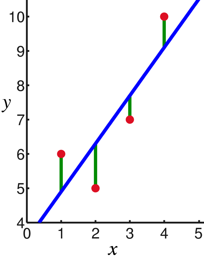
You can see that there’s a general trend upwards here, and if we wanted to come up with a general rule, we can construct a line – called the regression line, or ‘line of best fit’ – which suggests how this relationship might work.
Regression involves using an algorithm to calculate from your data points the line that runs through them which minimises the (vertical) distance between each data point and the line. For linear regression, the method is simple enough that for a small number of data points it’s possible to calculate by hand – roughly, it involves finding the mean averages and standard deviations of the data, and using this information to calculate the slope (a) and starting point (determined by b) of the line of best fit.
Intuitively, what you’re doing is finding a theoretical relationship between the two variables, such that the points that aren’t quite on that line are explainable by random fluctuations in the data – they roughly follow the line, but some minor variations are to be expected.
Obviously, linear models aren’t always right for any given situation – it often requires heavily simplifying what you’re studying, and in the example above, the amount of product sold could be influenced by multiple factors – the relationship might not even be linear, since more sales might also result in more people e.g. wearing your products in public, which might cause further sales without you even spending more on advertising. (I’m not a marketing expert, as you may be able to tell, but I’m trying to say that it’s unlikely you’ll find a real-world situation that’s completely straightforward).
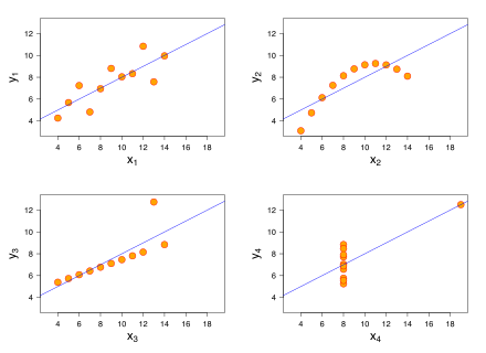
While having a simple model is useful, it can sometimes be misleading. These four graphs below are known as Anscombe’s Quartet, and each shows a set of data points which, when you apply linear regression, give the exact same regression line – even though they’re clearly different. The regression line is a tool you can use under the right circumstances to get a simpler picture of what’s going on, but like any tool, it needs to be used correctly.
Linear models can also be extended to multiple input variables (e.g. if you split the ‘amount of spend on advertising’ variable into different types of advertising, like TV or billboards), you can include multiple variables and each will have its own coefficient, such as y = a1x1 + a2x2 + b and so on. The more complex your model, the harder it’ll be to implement, but the more closely it’ll model the real world.
Connecting the dots
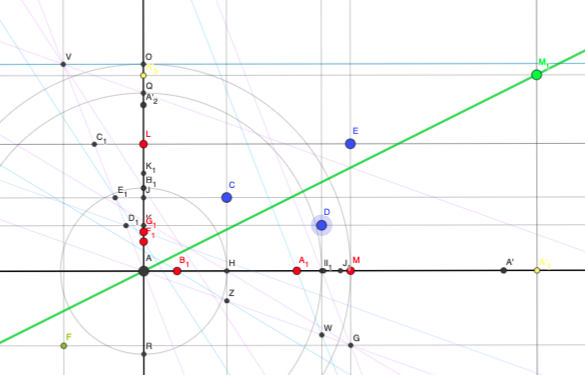
Now we’re ready to connect this idea to another bit of maths you might recall I have recently written about – ruler-and-compass constructions. The link my friend sent me was to an interesting Stack Exchange post entitled “Impractical question: is it possible to find the regression line using a ruler and compass?”
As I outlined in my previous post, it’s been well-studied which geometric constructions are possible (and proven impossible) using just a straightedge and a compass for transferring distances. If you were given a piece of paper with a set of data points, would it be possible to use construction techniques to draw the line of best fit for that data?
It turns out the answer is yes! In ruler-and-compass construction, you may recall it’s possible to construct particular lengths of line, including any number that can be made starting from a length of 1 and using the standard arithmetical operations of addition/subtraction, multiplication/division and square roots – these are called constructible numbers. Since the regression line is calculated using means and standard deviations – calculated using addition, division, squaring and square roots – this is all very possible using ruler-and-compass construction.
One answer to the question includes a link to an interactive Geogebra applet in which you can drag around the three blue data points and see the regression line move accordingly. (It’s a simple implementation in which it’s assumed that b=0, but could be extended to a more complicated setup).
This is such a lovely example of how different areas of maths overlap and connect with each other, and just the kind of question I’d like to encourage more of. (I especially enjoy how the original question as posed includes the sentence “This question has absolutely no practical application that I can think of”, which might well be true, but if you get bogged down in those kinds of worries you’ll never have any fun).
Footnote: In particular, there’s a tantalising thread of discussion suggesting that it might be possible to build a physical contraption to do this – since a spring attached to a mechanism will come to rest in a position that minimises the amount of energy needed to maintain its position, it could theoretically be used to construct a ‘line of best fit machine’ that bounces into place when you position the data points. It might not have a particularly practical application, but you have to admit that would be great!
I’m sure a Linear Regression Apparatus would be a nifty Christmas gift, even well received by students – provided something fun happens in the process and the right thing comes out of it in the end. Advice: Combine it with cat whiskers and let the machine purr while it slowly settles into the regression line!